Barber studio
Kings Cut Barbers
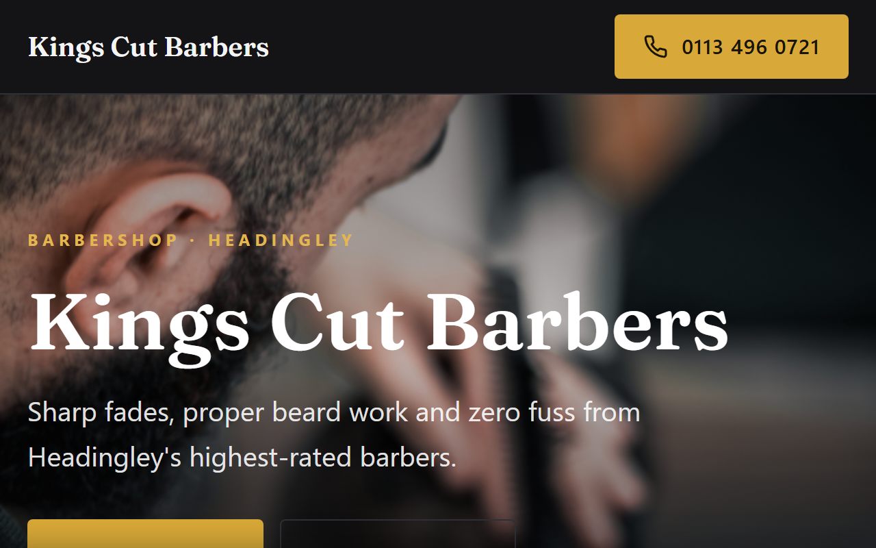
A demo for a fictional Headingley barbershop. Barbers sell atmosphere as much as haircuts, so this one breaks from the standard local-business layout entirely: bold, editorial, and confident.
The brief
A barbershop site has a short checklist: prices, photos, opening hours, and a way to book. The failure mode is making that checklist feel like admin.
The goal was a page that feels like walking past the shop window: you see the standard of work and the character of the place before a single button.
What I built
- A bold editorial layout with strong display type
- A proper price list with dot leaders, like a menu, not a table
- An asymmetric work grid showing cuts instead of stock imagery
- WhatsApp booking, because that is how barbers actually take bookings
- Opening hours and location built for a quick glance on mobile
Design decisions
No contact form anywhere. Forms suit offices; barbers live on WhatsApp and walk-ins, so the site leans into the channel customers already use.
The typography does the branding. A shop this size has no logo budget, but a strong display headline and a disciplined price list read as identity anyway.